|
BLACK & WHITE :intaglio
|
Ann Dowker |
|
5 December - 16 January 2015 |
ANN DOWKER
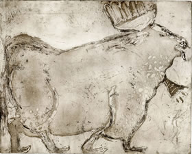
Pharaonic Bull, 2014. Aquatint, 48 x 60cm
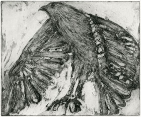
Birds of Egypt 1, 2014. Aquatint 14 x 17.5cm
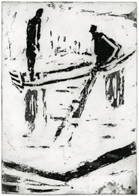
Fishing Boat, 2013. Aquatint, 21 x 15cm |
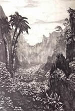
Ann Dowker's works have over the last decade centred on her journeys within Morocco and Egypt. Dividing her time between London and Luxor, for her recent prints and paintings she has focused on Egypt's Nile Valley (the Valley of the Kings) as a subject of special scrutiny.
As transient as it is historical, with its changing landscape and rich Pharaonic heritage, the region holds for Dowker an enigmatic charm. Describing Egypt as “the land of the temporary”, she delights in revisiting a 'world' with which she can never be entirely familiar. Houses, made of mud bricks, are built and pulled down; when a person dies in the morning they are buried by the afternoon; and as the Nile rises and floods (in spite of the Aswan dam), areas of land may disappear from view. For Dowker, Egypt is both bewildering and exciting, its erratic rhythm out of step with the reliable routines of Occidental culture. She experiences each visit, across the seasons, “in the moment”, with a renewed curiosity. Crucially, Dowker seeks out changed environments in order to rethink space and scale; her work has always strongly reflected on the formal qualities of surface and depth. She regards the Nile Valley as “unconventional” and “challenging”, and delights in its illusions. The uncanny layering of near and far distances, when water intervenes with land, puts her in mind of John Constable's compositions (which are never far from her thoughts):
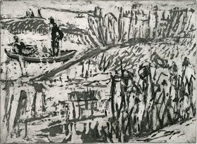
Every August, Banana Island is submerged in the Nile, turning the arable site into one of rowing boats and fishermen. Dowker's etching Banana Island (2013), depicts this event in a view that suggests both flat and recessive space. Though tall vertical reeds determine the foreground, and a fishing boat the far distance, her mark-making is subtly uniform throughout the composition. With just one acid bite of the plate, she does not vary the weights and tones of her aquatint gestures, but tantalises the eye with an array of competing monochrome marks. To gauge the space, she impels us to 'wade in' and inspect every inky detail of water and land. Dowker arrives at her compositions through incessant drawing, reworking and deconstructing scenes to discover new relationships of space and movement. As with the paintings, the subjects of her etchings initially take shape as pencil or charcoal sketches. Some of these will be thumbnail drawings or loose memoranda which she will abstract further on the etching plate with spare needle lines or aquatinted marks. In tune with the visual language of Egypt, often Dowker will reduce her etched figures and birds to mere signs – as simple silhouetted shapes (Fishing Boat, 2013; Sugarcane Eaters, 2014) or 'painterly' gestures (Birds of Egypt 1-4,2014). Avoiding narrative, symbolism or pastiche, these are not “pseudo hieroglyphics”, but her own visions of Egypt. Tomb inscriptions of birds may inform her subject-matter, but so too does the natural wildlife of the region: she observes how different bird species fly in groups; how they hover in search of food; how egrets sit in trees, for example. The fleeting actions and expressions of animals and people are intrinsic to Dowker's ethos of being “in the moment”. Describing herself as a “painter who prints”, Dowker regards etching as an extension of her drawing practice. Most of her etchings are unique, 'uneditioned' works – each impression marks a new approach as she experiments with the tones and densities of inks and, most importantly, the wiping of the plate. Trained in painting, she later took up etching under master-printer Dorothea Wight at the Camden Arts Centre and lithography at the Central School of Art and Design. Noted for her long-term collaboration with painter Leon Kossoff, her experimental approach as a 'painter-printmaker' suited his etchings projects: “He liked the fact I could see things through his vision, as it were. I'm quite impatient: I'd do one or two impressions exactly the same, and then I'd want to move on and wipe the plate differently”. Etching has always been vital to Dowker's oeuvre in that she looks to the unique qualities of the medium – its methods, materials and mark-making – to extend her vocabulary through chance and invention:
|
JOHN KIKI
|
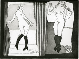
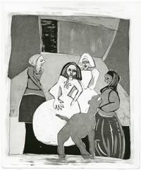
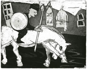
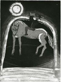
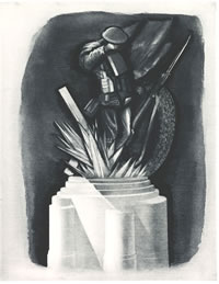
From horses, riders and dancers to infantas, gods and saints, John Kiki's lively paintings and etchings draw on the colourful subjects of human incident. Kiki hones his ideas from a motley range of sources, both ridiculous and sublime, sacred and profane. Images from high art and low life brush up against each other as subjects equally worthy of representation: pictures from newspapers and magazines, master paintings, Byzantine icons, and not least his own vast memory-bank of experiences. With its bright lights and nocturnal razzmatazz, the Norfolk seaside town Great Yarmouth (his home for over 30 years) feeds Kiki’s love of flamboyant themes. But so too does he look to the past for inspiration, taking the likes of Velasquez, El Greco and Picasso as his imaginative starting points. While his works are more about form than narrative, Kiki is no blind imitator of past masters; no slavish copier of what he sees around him. As a student of the Royal Academy Schools in the Sixties, he quickly tired of life-drawing and so distanced himself from direct transcription by distorting his figures and taking more time to think about the composition after observing the model. Through happy accident, his practice as a painter has imposed a similar distance between the eye and hand. The viscosity of acrylics requires that he place his canvases flat on the floor when working, immersing his line of vision more in the painting than on stimuli around him. Often he closes his eyes to envisage his subjects differently; to map them imaginatively in his mind. Indeed, Kiki relies on memory and reinvention to make borrowed imagery his own, and responds to the works of Velasquez (Infanta with Maids, 2011), Kirchner (Horse and Rider – After Kirchner, 2011) and others in a much abstracted sense. Though Kiki's language could not be described as 'abstract' as such, it is anti-naturalistic. Dispensing with perspective, he opts for a flat spatial arrangement. Often we encounter his figures at close quarters – face to face, in profile, or horizontally grouped in a line – as if they are presented before us 'on stage', standing (or leaping) to attention like circus or theatre performers (see Infanta With Muybridge, 2011; Dark Rider, 2014). To accentuate or frame their activities, Kiki segments his compositions in graphic 'blocks' – of stark colour for his paintings or monochrome aquatint tones for his etchings. Horizons (of sorts) may be implied through these hard-edged contrasts, but Kiki's 'worlds' remain disembodied spaces. He thrives on such tensions between representation and abstraction: “I want my subjects to be far from reality but to be compelling. I want to do something impossible but believable”. Kiki's approach to etching follows the schema of his paintings. Just as his canvases rapidly take shape with liquid acrylic outlines, 'drawn' from plastic squeezy bottles, so too are his etched lines inscribed without hesitation on to the plate. Sketched designs are, these days, anathema to Kiki's practice – a practice which greatly depends on the immediacy of putting down marks and constructing the composition intuitively without prior rehearsal. Kiki enjoys the ‘tightrope walk’ of taking risks through his methods; he accepts the false starts that require him to redact and rework his canvases or to begin again with a new plate. Etching has, however, added another dimension to his practice: collaboration with workshop printers, which makes his graphic works more exacting than the paintings. Following his drawing on to the plate with a needle, he etches and prints his 'first state' of outline images, then hand-tints the paper with ink or watercolour washes to schematise areas of aquatint tone. Rather than get involved with the technicalities of printing, Kiki prefers to guide the master-printer through his ideas, proofing and trialling techniques until satisfied. For him, the thrill of printmaking lies more in the plotting, proofing and decision-making than the complex, and sometimes laborious, procedure of pulling the edition: “I love seeing the end results”. |
DOLORES de SADE
|
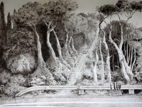
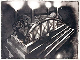
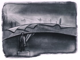
Primarily focused on landscape, Dolores de Sade’s works are concerned with memory, nostalgia, myth and narrative. In the context of modern industrialisation she questions what landscape means to us today and how it is distilled through popular media. Romantic landscapes are deconstructed by the artist as authoritative models of beauty and sublimity – as aesthetic paragons and cultural archetypes born out of nostalgia and reverie. These timeless pastoral visions, which have haunted our imaginations since the 18th century, are for de Sade problematic exemplars: idylls untouched and unspoilt by the emergence of modern industry stand contradicted by change and technology. Her work acknowledges that while the pastoral ideal served a transcendental purpose during the Industrial Revolution, it was in fact propagated by the very technology that revolution spawned: the advent of steel engraving in the 1820s, for book and periodical illustration, popularised Romantic landscapes to the emergent ‘mass reading public’. Technology, then, may be a catalyst for a fantastical retreat – it may trigger a perverse introspection that shuts out the modern world, rejecting the mediations of popular culture. At the same time, however, it may be a handmaiden, a technical facilitator, of artistic production. Multiplied and circulated, yet a product of the imagination, the printed image is the perfect example of this paradox, and which de Sade eloquently embraces to explore the disparity of our fantasised visions and material experiences. With the intricacy and application of her engraver forebears, in fastidious etched lines she deftly emulates the tradition of crisp topographical details and classical tropes. Vistas are framed by trees, leading the eye into bucolic worlds; bridges and stairs transport the mind to uncharted places. Yet, these are uncanny visions of low life elevated as high art. Dolores de Sade’s beautiful, Arcadian views are not set in the classical past; they represent prosaic modern subjects: motorway and A-road verges. Exalted as sites of dreamy delectation, these typically unromantic subjects question what we know and understand about today’s blemished environments. In an age of proliferating web imagery, online aggregators and virtual mapping, such places are on the one hand highly visible – meticulously quantified and exhaustively navigated. But, on the other, they are peripheral. The mediation of the World Wide Web and satellite navigation systems classifies such environments as utilitarian constructs; we see them through a monocular lens of expedient travel. Our reliance on modern technology thus diverts our attention away from other perspectives. But such places might be re-viewed and reclaimed, as near-forgotten natural realms that once again feed the imagination, as the focus of different kinds of knowledge. The authority of route-planning is duly challenged by de Sade as she re-evaluates and sees these discarded worlds on foot, at grass-roots level. The Grand Tour of yesteryear persists with undimmed optimism in her post-industrial prospects. Dolores de Sade studied Fine Art and Printmaking at the Sir John Cass School of Art and the Royal College of Art and holds a PhD in History from the University of York. She has exhibited widely in the UK and internationally. In 2011 she was the recipient of the Birgit Skiöld Memorial Trust Award and the Royal Academy’s British Institution Award. She is Chair of East London Printmakers. |
MICHAEL SANDLE, RA
|
<
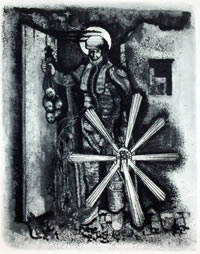
From memorials and funerary subjects, to his reflections on modern world events, the theme of time and memory lies at the heart of Michael Sandle's sculptures and prints. Politically and morally, the subject of war has preoccupied Sandle for much of his career. Often his works critically reflect on the relationship between global conflict and Western capitalism, the human cost of warfare, and the bias with which stories are packaged and sanitised by the media. The etching As Ye Sow (2014) reflects critically on Israeli strikes against Palestinians in Gaza and the brutality of Western bombings of Muslim civilians in Afghanistan and Iraq. Referencing William Holman Hunt’s iconic painting, The Light of the World (1851-3), the workrepresents an F16 pilot in place of Jesus, whose lamp is substituted with the heads of five children– Sandle's metaphor for the hypocrisy of Judaeo-Christian reactions to Islamic terrorism:
For these sobering subjects, blackness is essential to Sandle’s visual language. Where his sculpted bronzes (for example, Der Trommler, 1985-7, Tate Collection), with their black-brown patination, are oppressive and foreboding, his war prints carry a comparable weight and intensity with deep velvet-black tones. Chiaroscuro commands a menacing sense of death and oblivion, as ghostly ciphers of man and machine emerge from dark uncompromising voids. These dramatic tonal contrasts give his etchings and engravings a sculptural depth, translating three dimensions on the flat picture plane. Objects and figures become palpable as if within physical reach. Sandle’s practices as a sculptor and printmaker are closely related. Trained in etching, lithography and painting at the Slade School of Art (from 1956-9), under the instruction of Anthony Gross and Ceri Richards, and employed within the Parisian atelier of lithographer Gerard Patris (from 1959-60), printmaking has remained vital to his oeuvre and a basis for continual experimentation. His career as a sculptor, for which he is best known, was in fact borne out of his etching experiments when in 1961 he refashioned a copper plate into his first relief (Untitled, 1961, New Walk Museum and Art Gallery, Leicester). And while etching introduced him to sculpture, Sandle’s sculptural practices have, over time, greatly informed his intaglio work. Instinctively, the physical demands of engraving – of incising and burnishing metal – appeal to his sensibilities as a sculptor. Not only does he consider copper and steel plates natural counterparts to his reliefs and maquettes, but he employs sculptural methods in their rendering, often going beyond the needle and burin to exploit heavy duty tools. More industrial than artisanal, on steel plates Sandle enjoys working with a “noisy” mechanical engraver to achieve that indispensable “very black black”, while occasionally he appropriates a sand-blaster for graduated contours in the metal (see, for example, the plinth in World War 1 Ghosts IV). Such tools are strenuous but essential means of refining his visual language – for making lines stronger, definitions clearer, and tones deeper or subtler than would be possible through conventional approaches. Burnishing over the metal’s aquatint bites is for Sandle the most direct method of manipulating light effects in his shadowy compositions – a technique which enables him to impose his will over the capricious etched surface. Describing etching as “the most difficult method known to man to put a mark on paper”, he delights in conquering its resistance, employing engraving methods to master exactly his desired effects. Born in 1936 Michael Sandle studied at Douglas School of Art and Technology, Isle of Man and the Slade School of Fine Art. Periods of teaching in leading British art schools throughout the 1960s were followed by a three year period in Canada as visiting Professor at the University of Calgary and the University of British Columbia. In 1973 he moved to Germany where, in 1980, he was appointed Professor of Sculpture at the Akadenmie der Bildenden Kunste, Karlsruhe. Elected Royal Academician in 1989 and Fellow of the Royal Society of British Sculptors in 1994, he returned to the UK and now lives and works in London. |
Julia Beaumont-Jones, Art Space Gallery, 2014 |